Tuesday, 30 December 2014

Music Video Draft Feedback

Feedback

Some of the feedback I was given on my music video draft included:

  • Change the version of the soundtrack so it does not cut off at the end.
  • Use more effects
  • I like the dream idea however maybe have it appear more throughout the video as opposed to just once.
Here are some screenshots of feedback from my peers, most of which I took on board when making my final draft. 


Monday, 29 December 2014

My Equipment

Nikon D3200


I used the Nikon 3200 which I thought was a great camera to capture everything I needed. It was really good for the outside filming and allowed me to shoot everything I wanted to. I would definitely use this camera again. 

Some of the built in functions are listed below: 

- 24MP CMOS sensor
- ISO 100-6400 (plus ISO 12,800 - equivalent Hi1 setting)
- Expeed 3 processing
- 3.0", 920k dot screen
- Full HD 1080p30 video (with 50p and 24p options)
- Microphone Socket
- Twin IR remote receivers
- 4 Frame-per-second continuous shooting
- Guide mode


Annotated version of my Music Video


Music Video Draft

Stop the World Draft


Tuesday, 23 December 2014

The Change

The Change

Due to my actor, Joe being very unreliable and not being very good on camera, I decided to find a new male lead in which I found Adam. Unfortunately, this meant that I had to start from the beginning and therefore, as it was so late in the year, my Magazine Advert and Digipak no do not match my video.
I ended up changing my whole idea just to suit my new actor..

My new idea:

I wanted to go with the theme of reflection as my actor has a female friend whom he is very fond of and wants to be his girlfriend. I wanted to use the idea of the water as being reflective and she is everywhere he looks.

Saturday, 20 December 2014

My Final Digipak

This is now my final product of my digipak after making the improvements.


Magazine Advert Drafts with feedback

Magazine Advert Drafts with feedback


Feedback:

  • A different image would be better
  • The background is very dark and doesn't match the digipak
  • Make the writing smaller and in line with each other
  • Space out the writing evenly


Feedback:
  • The writing is too big
  • The artists name and name of the song is not in line
  • The website should be at the bottom
  • The reviews would look better next to each other
  • Add the record label logo


Thursday, 18 December 2014

Feedback on Digipak

After I received my feedback, I was told to take off the lyrics as I have a lot of writing altogether and also to change the font of the message to the fans by making it look less chunky and more personal. 


                                                                                    I was told that the digipak is nice because the theme is constant that runs through it and the guitar suits the indie rock genre. Also, writing a message to the fans was a good idea as it gave a nice touch to finish off in order to connect with the audience.

Tuesday, 16 December 2014

Magazine Advert

A Magazine Advert needs to include:

Artist name
Album title
Out now
Star ratings with publication name
Quote from publication
Artist website/facebook
Available now
Parental Advisory
Record label logo

Ideas for my artist

Ideas for my artist:


  • Theme of fire presented through his eyes and his heart.


  • Obsession with a girl who broke his heart which has led him to writing this song.


  • He is the type of artist who is a ladies man who is very narcissistic.

Wednesday, 10 December 2014

Digipak Front Cover

Digipak Front Cover

This was my initial attempt for my digipak cover. I used this as a basic outline to develop it further into something more appealing to an audience. I chose a black background as I thought this would make him stand out as an individual artist more. Also, the orange text was chosen to link in with the theme of fire which is significant in the title 'Fire in your eyes'. I masked the image in after effects to make it look like he is sitting down at a performance. Also I thought it fit in well on the side of the cover. I went for quite a simple design on the cover as I think sometimes you can get more from something simple. 
After some thinking about it, I decided that it was too simple and wasn't a good reflection of my artist, therefore i developed it by adding a texture to the gradient fill and researched fonts that would suit my artists style of music. I also used the 'inner glow' effect to create the look of fire in the text. I increased the size of his name to make it stand out as the name Flynn is not overly memorable even though I think it's a name that reflects him well. I have also added a colour correction to the image of him in order to make him look less plain and so he now fits in with the theme of the album too. 
This was a screen shot from my preparations half way through my digipak where I thought it would be a good idea to have one image of fire to represent the theme of my album and also I put one of his photos in a spotlight to make him stand out as the star. The texture on my front cover I was told would look better if there was the same texture on the back cover so I have recently added it in. Lastly, some feedback I was given so far was that on the front cover, it looks like his legs are missing so I used a tool to blend the black in to make it look like he's just covered as opposed to had his legs taken off. 


The Editing Process - Digipak

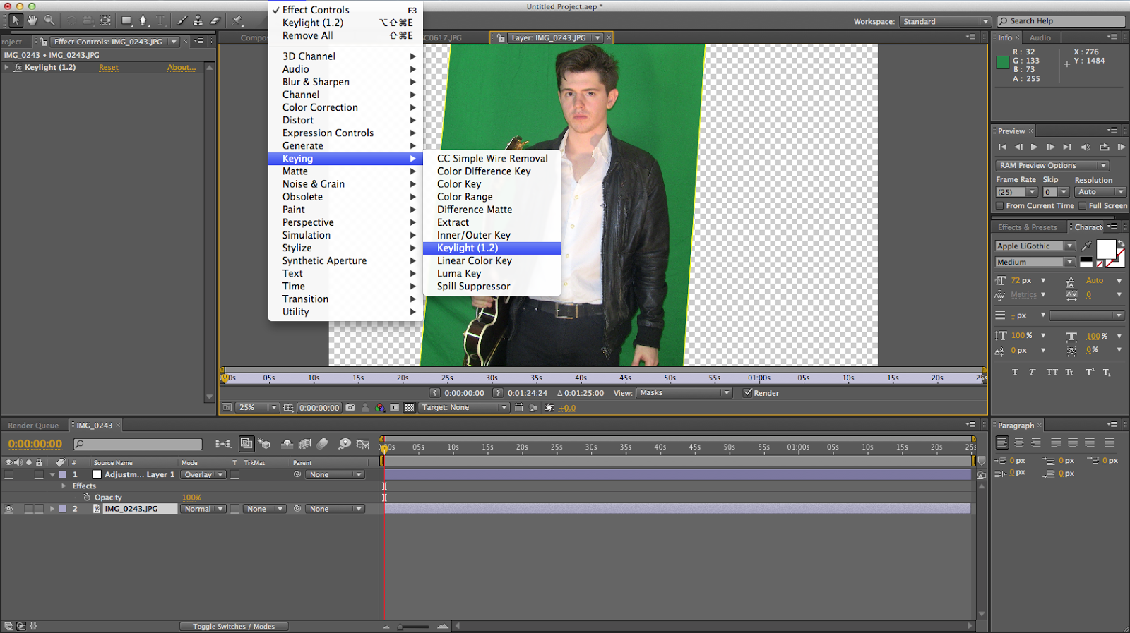
I used after effects to block out the green screen. Firstly, I used the pen tool to crop the image then I clicked on effects on the top bar, keying, followed by the keylight option. This gave me more options to change the image to screen matte and change the lighting using black and white. I then softened the edges to make them clearer. I did this with many different photos and I masked some of them to just get his outline.


This image shows in the bottom left square how I masked around my actor to make the his message to his fans fit nicely around him.

Wednesday, 26 November 2014

Choosing the name

Flynn


When it came to choosing the name for my artist, I took a long time deciding because I wanted it to sound realistic. I looked on many websites online to find one that was suitable and came up with the name 'Flynn'. I think this name suits my artists image as well as the image I am creating for him within the band.

My Cast

My Cast

I have chosen to use Joe Rogers as my actor because he is 23 years old which is within the age range of the target audience and he is also part of a band which makes it easier to then also cast the band for the video. Due to his performing experience, he has a lot more confidence on camera and he will actually sing the song which will make the lip sync more realistic. The only downside to casting Joe for my video is that he has a very busy schedule due to his career in his band alongside his part time job. This made it very difficult to find the time to shoot my video with him and his band as we were never available at the same time. In the end we did manage to find the time to film however, I couldn't get all the shots I wanted due to his timings and it was too dark outside for the shots I had planned. 

How to attract 'my perfect audience member'

How to attract my perfect audience member

I will use an interesting font on my digipak and titles for my video in order to catch my audience members eye. Using bright, eye catching colours will definitely attract them to my video as they like things that are different and stand out from the crowd. I will also use really fascinating images from not only the photoshoot but by using masking to place my lead singer onto a billboard in order to keep my audience intrigued for the rest of the video. 

Audience Research

Audience Research


NME magazine is an indie rock magazine for young people in the UK. It's target audience is aged 16-24 as stated on their website 'intensely engaged audience of 16-24 year olds'.
According to their website, 66% of their audience is male with only 34% female. 

Stereotypical Target Audience: 


Gender: Male

Age: 16-24

Ethnicity: White British

Interests: Music, photography, piercings, tattoos, gigs, smoking, twitter, festivals, tumblr, instagram and instruments. 

Dress sense: Shorts, jeans, baggy t-shirts, band t-shirts of indie rock bands, dyed hair, glasses, denim shirts/jackets, backpack, natural look.

How often they listen to music: They like to go to festivals and they like the sound of guitar based music. 

What magazines they would read: They would be interested in magazines focused on current artists such as Arctic Monkeys etc. they would buy magazines such as Q or NME Magazine. 

My Target Audience:

Name: Tom

Age: 16

Lives in: London

Work Status: Student and works part time

Ethnicity: White British

Magazines you buy: NME, Q and Kerrang

Favourite Bands: Paramore, Arctic Monkeys, Radiohead, Foster the People and The Strokes.
 
Attractions to the front cover of the magazine: The colours, fonts and images. 

Interests: I like to play the bass guitar with my band, write and listen to music, go out with my friends, cycle, do drawings, go to festivals, read magazines and photography.

How often you listen to music: Everyday as much as I can.

Dress sense: Black jeans, scarfs, long hair/slightly curly, natural look, shirts and band t-shirts.

Friday, 7 November 2014

My Pitch

My Pitch

Research Audience

Research Audience:

Uses and gratification:

Passive <--------------Audience-------------->Active

Assumes that media audiences are passive - Media effects theory

Active audiences are more discerning - They actively seek out texts to have their needs met or gratified.

USES:

1. To be informed 

  • Performance
  • Self-identity
  • Perception by others
  • Interesting-growing
2. To be entertained
  • To be amused / distracted
3. As escapism
  • Stressful world

4. Catalyst for social interaction

5. Sense of identity


Test Shoot

Test Shoot

Using after effects, I was able to practice my editing even though I am aware the footage I have is not appropriate for my final music video.
I practiced cropping the image which made me aware that if I film on 18 and the surroundings are in the shot then it can be cropped out however, the further away I shoot it the better.

I then experimented with the lighting and how you can make your original image look entirely different. I found this really interesting as I am now aware of the different things I can do to my footage the next time I shoot. I also used a tool to make his outline a lot sharper in order to make him stand out more. This really made the image appear more professional.
I later looked at how I can make the background different colours from using the green screen which I thought was really interesting to see how different you can make the original image I had filmed. I also learnt how to change the background to a moving image which I could use when putting his face on a billboard for my final video. 

Wednesday, 5 November 2014

Production Company & Logo

Production Company & Logo

I have chosen to use 'Domino' as my production company as they produce music by indie rock and indie pop bands including Arctic Monkeys. Their first UK Number 1 was Arctic Monkeys' "I Bet You Look Good On The Dancefloor". 

I think this company would suit my song because they have already produced songs of the same genre and from the same band. 


Copyright Email

Copyright Email 


Digipak Covers

Digipack Covers

I have researched different types of Digipaks and chosen a few that I think are similar to the kind of Digipak I intend on creating.
I like this example of a back cover as it has incorporated an image of the band performing. It has also included quotes about the songs as well as a background of the album in order to attract an audience before they hear the songs. I really like the lighting on this cover which you can see has been changed through the editing process. I think this is really effective as it catches your eye and gives you all the information you need about the album.

This Digipak is a good example of one which I would create as it has the main artist on the front cover with his guitar, very similar to mine and I like the idea of having photos of people from the video on one cover. In my video this could be images of the girl to further represent his obsession with her. I don't like the font used on this album as it is not clear to read which takes away the attraction from the cover.
I really like the shadows and reflection used on this album cover. It's as if he's looking back at himself. I think the colours are a little bit bland and therefore, will not appeal to an audience as quickly. The costume of the artist looks very smart which tells the audience about the style of the music.

Wednesday, 22 October 2014

Digipak Conventions

Conventions of a DIGIPAK

  • Front Panel - Artist name (bigger text than the title), album title, close-up of the artists face, parental advisory, capture the genre, direct appeal to the target audience.
  • Back Panel - Song titles, barcode, copyright information, information about the record label, website, continuing the theme of the front cover.
  • Spine - Name of artist, name of the album, record label, reference number, font/colour scheme continues the theme.
  • Interior Panels - Detailed credits, lyrics, continuing the theme of the rest of the album, a message, images of the artist or setting, CD tray has image behind it, spread an image across two panels on the inside. 

Friday, 3 October 2014

Star Image - Miley Cyrus

Star Image - Miley Cyrus

Andrew Goodwin uses the term ‘Star Image’ and refers to the ‘image’ an artist will portray themselves as in order to appeal to their target audience.  Goodwin stated ‘the creation of character identities for stars provides a point of identification for the audience, which is especially important when lyrics lack depth.’ This highlights the way in which an artist is represented as being crucial. Furthermore, the star image is the best way for an artist to reinforce their new persona, which is often shown through close ups in their videos. Miley Cyrus is a perfect example of how an artists star image can be radicalised over time and the impact their star image can have on their success. I have divided Miley’s star images into three categories:

Sweet and innocent Miley:


In this video which was released in 2008 whilst Miley was starring in Disney Channel's Hannah Montana, we can see that she is presented as being a better role model to her TV audience. The clothing she wears is a unique style however, it is suitable for the children who idolise her. Therefore, she has to appear to be a sweet young girl so that parents will be happy for their children to be watching her programmes. 
Dancing Miley:


'Party In The USA' was released in 2009 and this is where Miley started to relax and find herself. Her video now included more provocative dancing in comparison to '7 Things' and she now has more dancing girls who are dressed in a more revealing way as is she. It was soon after this that Miley stopped filming Hannah Montana and therefore she didn't feel as though she had to be someone her audience wants her to be. 

Sexual Miley:


My final comparison is this video which was released in 2013. In this video, we can see a drastic difference in her clothing which has turned into not wearing very much as well as her provocative dancing which we can see in this picture where she's on all fours and sticking out her bottom to show her sexual attitude. 

As we can see, there has been a huge change in Miley Cyrus' star image in just 5 years of fame. She has now become more sexual and  provocative which is definitely inappropriate for young children. As Goodwin said that an artist will portray themselves in a way that will appeal to their target audience. In this case, Miley was young herself in 2008 and therefore her target audience was people her age who watched her programme. Recently, her image changed as her target audience changed due to her growing up and maturing as a person. She has developed her image and made herself appeal to people more of her age group now. 

Star Image - Britney Spears

Britney Spears

Britney Jean Spears was born December 2, 1981. She is an American recording artist and entertainer. 
She has worked in many genres such as dance-pop, electropop and pop. 

This is Britney Spears when she was a young girl. We can see her sweet and innocent image has substantially changed as Britney developed into a teenager. As her fame progressed from her hit single 'Hit me baby one more time' Britney began to realise what she should do to attract a wider audience. This led to her changing her style from a young innocent girl trying to make it in the music industry to a seductive young woman looking to attract a different audience and make more album sales. 


 Britney's costumes had a rapid change as she began to wear more revealing outfits which show off half of her body in order to catch the eye of the male audience. The images released of her in her underwear also gathered a wider audience as men are the targets of her videos as she's matured because she clearly finds it easy to act in a sexual and provocative manner on camera. It appears to come naturally to Britney as she has been doing it for many years now.
As Britney Spears had her children, her image changed again to a more motherly figure otherwise she would have made a bad reputation for herself and would have lost her female audience. Over the last few years Britney Spears went in and out of rehab as she dabbled in drugs after having had such a successful career. The fame and money meant she could have anything she wanted which is why she was not really happy. This led to her shaving all her hair off which was a complete change and also made her lose a lot of her audience as she was being judged for her behaviour. 

Some examples of Britney Spears' music videos are:


In this video we can see Britney with her in pony tails to exemplify her innocence and her age. There is also the image of her dancing more sexually and she has her stomach on show which could be seen as her trying to be like other female artists which very popular in order to be a success herself. She is shown to be performing in her video and there are many close-ups of the artist throughout the video to draw attention to her and make the record company sell more albums as the audience will have a stronger connection to Britney through these close-ups. The setting being in a school highlights her age, as well as the school uniform. Britney Spears has developed as an artist since her first video to now because of the audience she is trying to appeal to. She turned into a more sexual artist through changing her style of clothing, hair and puts a lot more makeup on now. 


Thursday, 2 October 2014

Initial Ideas

Initial Ideas for my Music Video
Song Choice:
Arctic Monkeys: Stop the world I wanna get off with you
Locations:
Campfire, Central London, a gig, house party
Actors: x2
Joe Rogers, his band and his female actor friend - (Joe with his guitar)
Costume:
Joe in jeans and leather jacket
Female character in a summer dress
Time of filming:
Mixture of daytime and nighttime filming. Campfire at night, gig in the evening, central london during the day.

Miley Cyrus - 'Party in the USA' Analysis - Vernallis

Miley Cyrus - Party in the USA 


Vernallis' theory suggests that The star of the music video should be the main focus throughout however, there is usually a background of performers in a performance video. In this case, Miley Cyrus is the singer therefore, all eyes are on her, even though she has people in the background dancing behind her. Vernallis doesn't think this takes away from the main artist as long as there is the right kind of staging so Miley here is placed at the front to make the audience aware that we should be watching her.  

Another of Vernallis' theories is that the lip sync should be obvious to the audience, therfore there should be close ups of the artist to show them singing the song as she believes that this reels the audience in which makes them by the video because it makes the artist more engaged with the performance if they can see Miley singing the song.

Party in the USA is edited to the beat as the change in melody cuts to the scene of Miley on the swings which matches the tune of the song very well as well as matching the lyrics 'Feel like hopping on a flight' whilst she swings back and forth.