Saturday 3 January 2015

Evaluation Question 3


What have you learned from your audience feedback?


This is my music video draft which I received all my audience feedback on before making my final edit. I have made annotations to the video to highlight my intentions and things the audience feedback has told me about what they interpreted from my video.


Rough Magazine Advert:


This was my rough magazine advert which I was told from my audience feedback that the text was too spaced out and the font was too large. I was also told that the magazine ratings would look better if they were at the top, above the 'Includes hit single' but below his name and the album name. I agreed with this and therefore, I made all of these changes in order to produce my final Magazine Advert. 

As you will see in my Prezi below, I have included the final magazine advert with the feedback I received.


Friday 2 January 2015

Evaluation Question 2

How effective is the combination of your main product and ancillary texts?

My Magazine Advert:


I spent some time researching magazine adverts in order to discover the conventions. I came up with a few different ones such as:

  • They all have the name of the artist and the album in a bold font.
  • They all have the release date to tell people when the video is coming out.
  • They all include reviews from popular institutes such as Kerrang, Daily Mirror etc. 
  • The record label logo
  • The web address for the artists official website to allow fans to know more about his music or his personal life.
  • A genre defining album.


My Digipak:


I have followed as many conventions of a digipak as possible. 

Front Cover: 

I tried to use as many of the conventions of a front cover for a digipak as possible. Some of these include:

  • The artist name has to be large and clear enough to be recognised by the public and mainly fans that will be after his new album
  • The album title is clear and bold for everyone to read and understand although it ties in with the colour scheme of the Magazine Advert. 
  • There is an image of the artist that reflects on his genre of music. I chose to use an image of him with his guitar because I felt that best represented him as an indie rock artist and his straight face shows his focus on his music.

Back Cover: 

I followed all of the conventions for a digipaks' back cover in order to make it look more authentic.

  • The song titles are in order and in the same size and font to keep the continuity between the magazine advert and the digipak
  • I have put the bar code at the bottom to sell to retailers
  • The logo for the record label, record label website and record label postal address to be able to contact them for any enquiries
  • Copy right information
  • This has a continued theme of the front cover of the digipak and magazine advert with the same fonts, colour and background. 


Here is an example of Rihanna's back cover with annotations as to what should be included and where. I particularly like this image because it is very clearly presented and very well explained.


Inside:

Here are the four panels inside my digipak which all follow a continuous theme to make it look like its all for the same artist.


I have created a space for the CD to go by using a transparent image which also reflects the theme of the digipak being fire. This creates easy access for the audience to take the CD in and out. I have also used the background texture again here to signify the similarities.


Image of the main artist with a message to his fans, thanking his fans for the support they're giving him. This is usually what upcoming artist do to gain supporters love. I used a different font for the signature to make it look like he had signed it himself. Also the bright light on him shows the fire in him and his music as well as his recent progression from a niche artist to a star.


A panel with an image of his guitar to further highlight the significance of his guitar in his music. This shows him being a passionate musician. I have chosen to leave the backgound clear because most digipaks do not fill every space and I felt it looked better without anything as it shows my artists mysterious side.


Another close up image of the artist posing with lighting exposing his features. In my case I have used the fire theme to expose his features through lighting so that I can maintain the theme at the same time. I chose to use an image of my artist pointing at the audience to show his confidence in his music.


The Spine:
  • The spine has to clearly have the artist name and the album name clearly
  • They also include the record label logo and possibly a CD number
Examples of spines on a digipak:


Thursday 1 January 2015

Evaluation Question 1

In what ways does your media product use, develop or challenge forms and conventions of real media products?

Initially, when I began planning my music video, I did not know what my narrative was going to be about. I had chosen the song 'Stop the world I wanna get off with you' by Arctic Monkeys and started by analysing the lyrics to help me gain a vision as to what the song was really about. This helped me to produce an idea of my videos theme. My aim was to express my artists emotions towards his friend who he wants to be his girlfriend. I watched different music videos to find some inspiration. This enabled me to produce a storyboard with all the shots I wanted to get and gave me confidence in knowing what I wanted to shoot on the day. I followed many music video conventions however, I also challenged some of the conventions of the genre to make my video different and more interesting.

Here are 9 frames from my music video that follow the conventions:


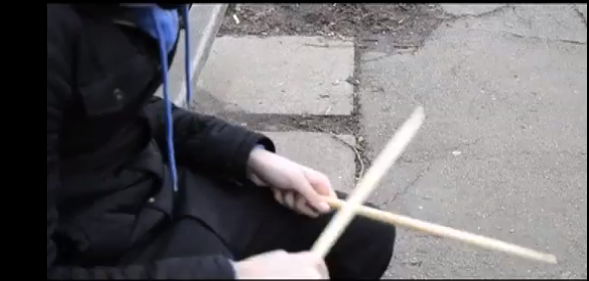
The opening shot of the drumsticks hitting together to the beat signifies there is going to be an element of performance in the video which is a key feature of music videos. Also, indie rock music typically has a band which generally consists of a drummer. This is the first impression the audience will get from the video.
A convention of music videos is to have extreme close ups of the artist to show their expressions and emotions. In this case, I have used this close up to show a flash into his day dream of him and his friend, a girl he really wants to be with. This shot allows the audience to understand the narrative as the close up highlights my intention for the audience. This helps to convey the meaning behind the song, another convention of a music video.

To further highlight that we are in his dream sequence, I have used an effect to change the lighting of the clip, which shows there is a difference between the rest of the footage. Also, this is the only footage we see of the two of them happy together which is also why I have chosen to make this stand out from the rest of my shots. Effects are very popular on music videos especially of the indie rock genre.
This image shows the artist on a roundabout. I changed the speed of this footage to make it appear to be not only him in a thought process but also to symbolise his reflection on himself and the girl. I felt the roundabout would be a good way to represent how he's feeling in his mind. The constant spinning signifies his mind and his thoughts going round in his head about what to do.

The footage of his view from the roundabout is also something I slowed down to make it seem more apparent and more significant. Indie rock music videos typically change the speed of their footage and music videos in general should use different effects in order to keep the audience engaged with what is going on.
I have made my lip sync match my artist singing and have made my lyrics match the visuals as Goodwin's theory states that music videos should have a relationship between visuals and lyrics. I have also used another effect here called the mirror effect to show a metaphorical sense of reflection. I felt that although he is reflecting in himself, I wanted to show his thoughts through my editing at the same time.

I decided to use this over the shoulder shot to show how engrossed he is in her eyes which matches the lyrics "eyes the colour of". The mise-en-scene helps to build the narrative and show his emotions through the way I have filmed him looking at the picture. This is another time where we see him reflecting and thinking in the video.
The water at the lake is a key element of my video because it is a peaceful place for someone to go and think about things they have on their mind. By setting the scene I have followed the conventions of a music video and through the repetition of it, it has made it clearer for the audience, therefore it does follow conventions as the tone of the music matches the imagery.

This last image highlights his reflection of himself in the window and also allows the audience to engage with his thought process about how to handle the situation with his friend. He feels lost and I think my video really portrays this feeling all the way through to help build the narrative which is another key element of a music video. 

Stop the World - Final

Final Music Video

Here is my final video of 'Stop the World'.