Tuesday, 30 December 2014

Music Video Draft Feedback

Feedback

Some of the feedback I was given on my music video draft included:

  • Change the version of the soundtrack so it does not cut off at the end.
  • Use more effects
  • I like the dream idea however maybe have it appear more throughout the video as opposed to just once.
Here are some screenshots of feedback from my peers, most of which I took on board when making my final draft. 


Monday, 29 December 2014

My Equipment

Nikon D3200


I used the Nikon 3200 which I thought was a great camera to capture everything I needed. It was really good for the outside filming and allowed me to shoot everything I wanted to. I would definitely use this camera again. 

Some of the built in functions are listed below: 

- 24MP CMOS sensor
- ISO 100-6400 (plus ISO 12,800 - equivalent Hi1 setting)
- Expeed 3 processing
- 3.0", 920k dot screen
- Full HD 1080p30 video (with 50p and 24p options)
- Microphone Socket
- Twin IR remote receivers
- 4 Frame-per-second continuous shooting
- Guide mode


Annotated version of my Music Video


Music Video Draft

Stop the World Draft


Tuesday, 23 December 2014

The Change

The Change

Due to my actor, Joe being very unreliable and not being very good on camera, I decided to find a new male lead in which I found Adam. Unfortunately, this meant that I had to start from the beginning and therefore, as it was so late in the year, my Magazine Advert and Digipak no do not match my video.
I ended up changing my whole idea just to suit my new actor..

My new idea:

I wanted to go with the theme of reflection as my actor has a female friend whom he is very fond of and wants to be his girlfriend. I wanted to use the idea of the water as being reflective and she is everywhere he looks.

Saturday, 20 December 2014

My Final Digipak

This is now my final product of my digipak after making the improvements.


Magazine Advert Drafts with feedback

Magazine Advert Drafts with feedback


Feedback:

  • A different image would be better
  • The background is very dark and doesn't match the digipak
  • Make the writing smaller and in line with each other
  • Space out the writing evenly


Feedback:
  • The writing is too big
  • The artists name and name of the song is not in line
  • The website should be at the bottom
  • The reviews would look better next to each other
  • Add the record label logo


Thursday, 18 December 2014

Feedback on Digipak

After I received my feedback, I was told to take off the lyrics as I have a lot of writing altogether and also to change the font of the message to the fans by making it look less chunky and more personal. 


                                                                                    I was told that the digipak is nice because the theme is constant that runs through it and the guitar suits the indie rock genre. Also, writing a message to the fans was a good idea as it gave a nice touch to finish off in order to connect with the audience.

Tuesday, 16 December 2014

Magazine Advert

A Magazine Advert needs to include:

Artist name
Album title
Out now
Star ratings with publication name
Quote from publication
Artist website/facebook
Available now
Parental Advisory
Record label logo

Ideas for my artist

Ideas for my artist:


  • Theme of fire presented through his eyes and his heart.


  • Obsession with a girl who broke his heart which has led him to writing this song.


  • He is the type of artist who is a ladies man who is very narcissistic.

Wednesday, 10 December 2014

Digipak Front Cover

Digipak Front Cover

This was my initial attempt for my digipak cover. I used this as a basic outline to develop it further into something more appealing to an audience. I chose a black background as I thought this would make him stand out as an individual artist more. Also, the orange text was chosen to link in with the theme of fire which is significant in the title 'Fire in your eyes'. I masked the image in after effects to make it look like he is sitting down at a performance. Also I thought it fit in well on the side of the cover. I went for quite a simple design on the cover as I think sometimes you can get more from something simple. 
After some thinking about it, I decided that it was too simple and wasn't a good reflection of my artist, therefore i developed it by adding a texture to the gradient fill and researched fonts that would suit my artists style of music. I also used the 'inner glow' effect to create the look of fire in the text. I increased the size of his name to make it stand out as the name Flynn is not overly memorable even though I think it's a name that reflects him well. I have also added a colour correction to the image of him in order to make him look less plain and so he now fits in with the theme of the album too. 
This was a screen shot from my preparations half way through my digipak where I thought it would be a good idea to have one image of fire to represent the theme of my album and also I put one of his photos in a spotlight to make him stand out as the star. The texture on my front cover I was told would look better if there was the same texture on the back cover so I have recently added it in. Lastly, some feedback I was given so far was that on the front cover, it looks like his legs are missing so I used a tool to blend the black in to make it look like he's just covered as opposed to had his legs taken off. 


The Editing Process - Digipak

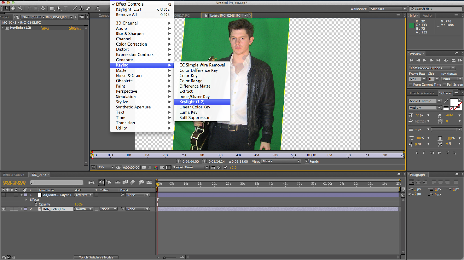
I used after effects to block out the green screen. Firstly, I used the pen tool to crop the image then I clicked on effects on the top bar, keying, followed by the keylight option. This gave me more options to change the image to screen matte and change the lighting using black and white. I then softened the edges to make them clearer. I did this with many different photos and I masked some of them to just get his outline.


This image shows in the bottom left square how I masked around my actor to make the his message to his fans fit nicely around him.